Overview
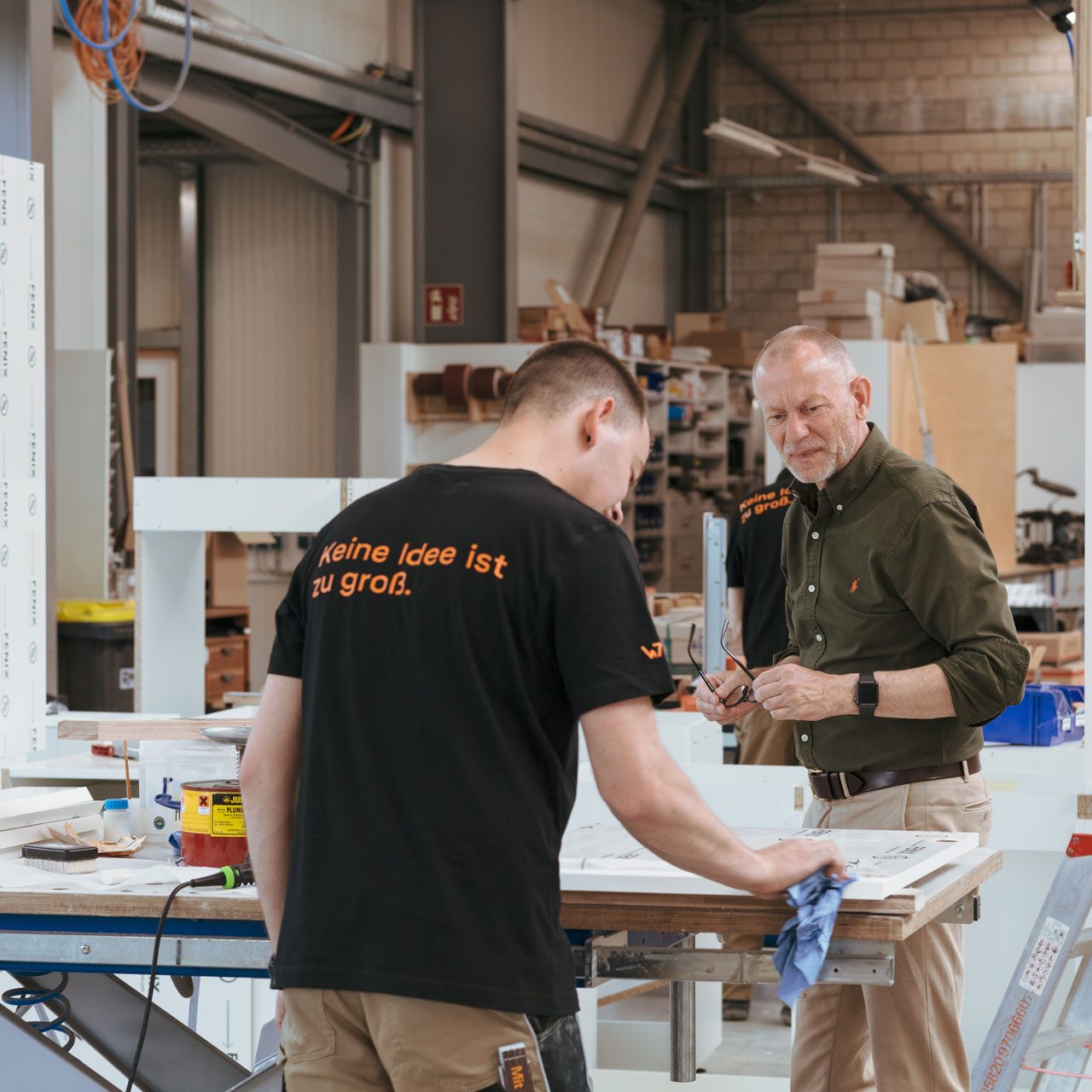
With the last change of generations, more and more international clients came: Paris, Beijing, USA. And with them, more and more crazy project requirements and larger teams. The demands on the brand of the Hamburg-based hidden champion had changed.
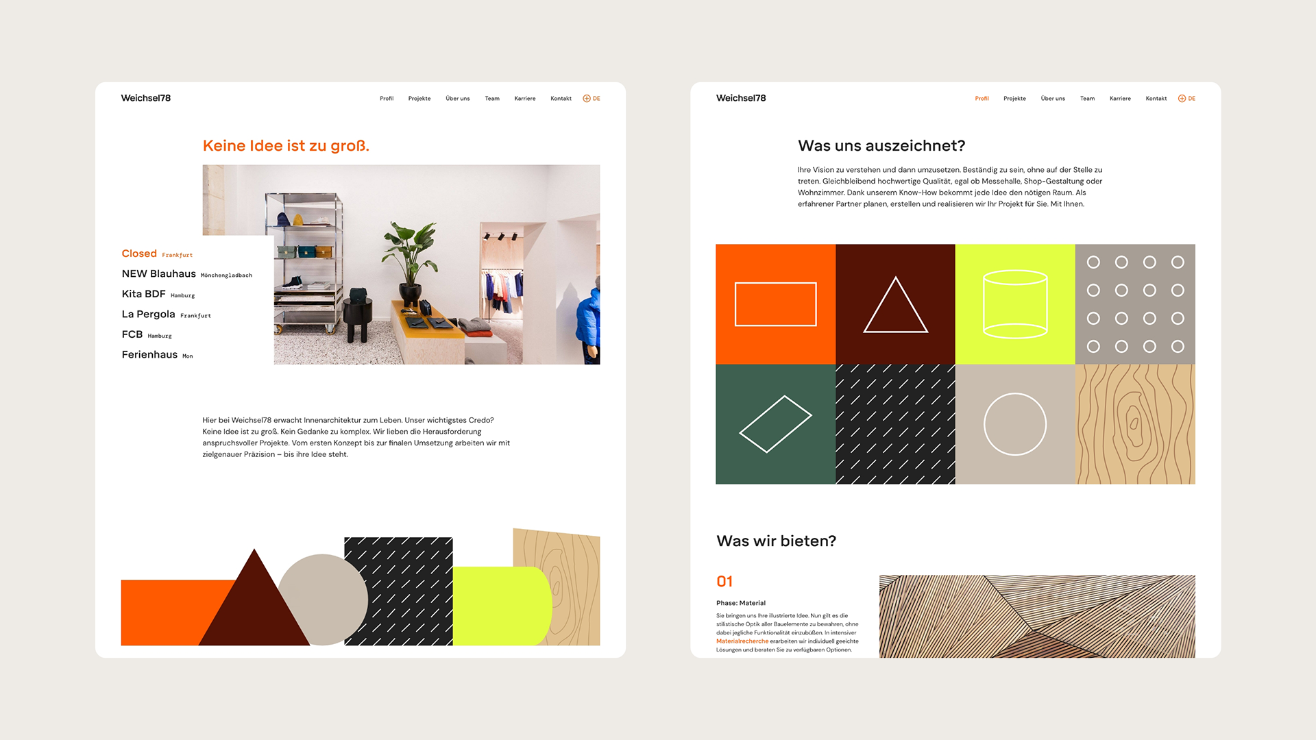
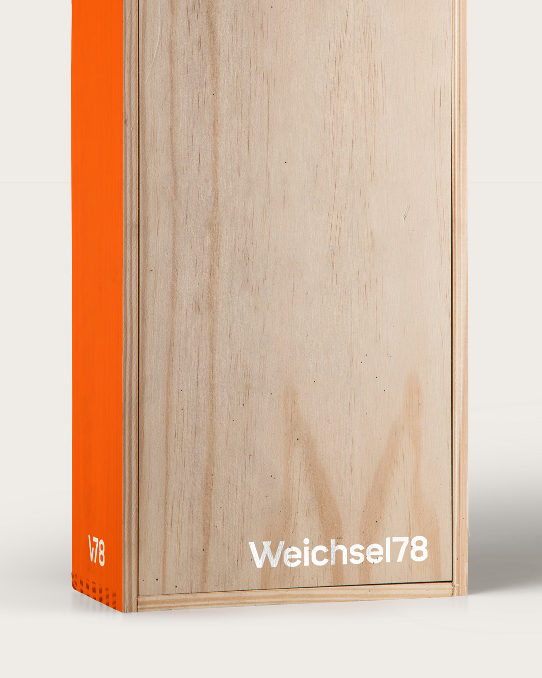
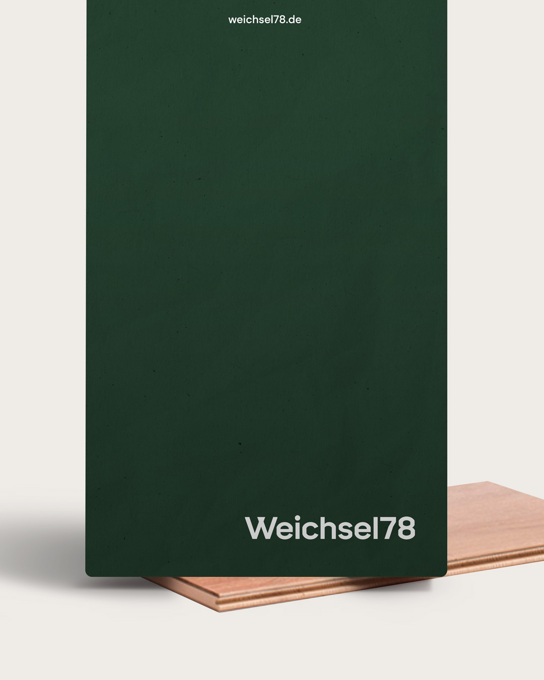
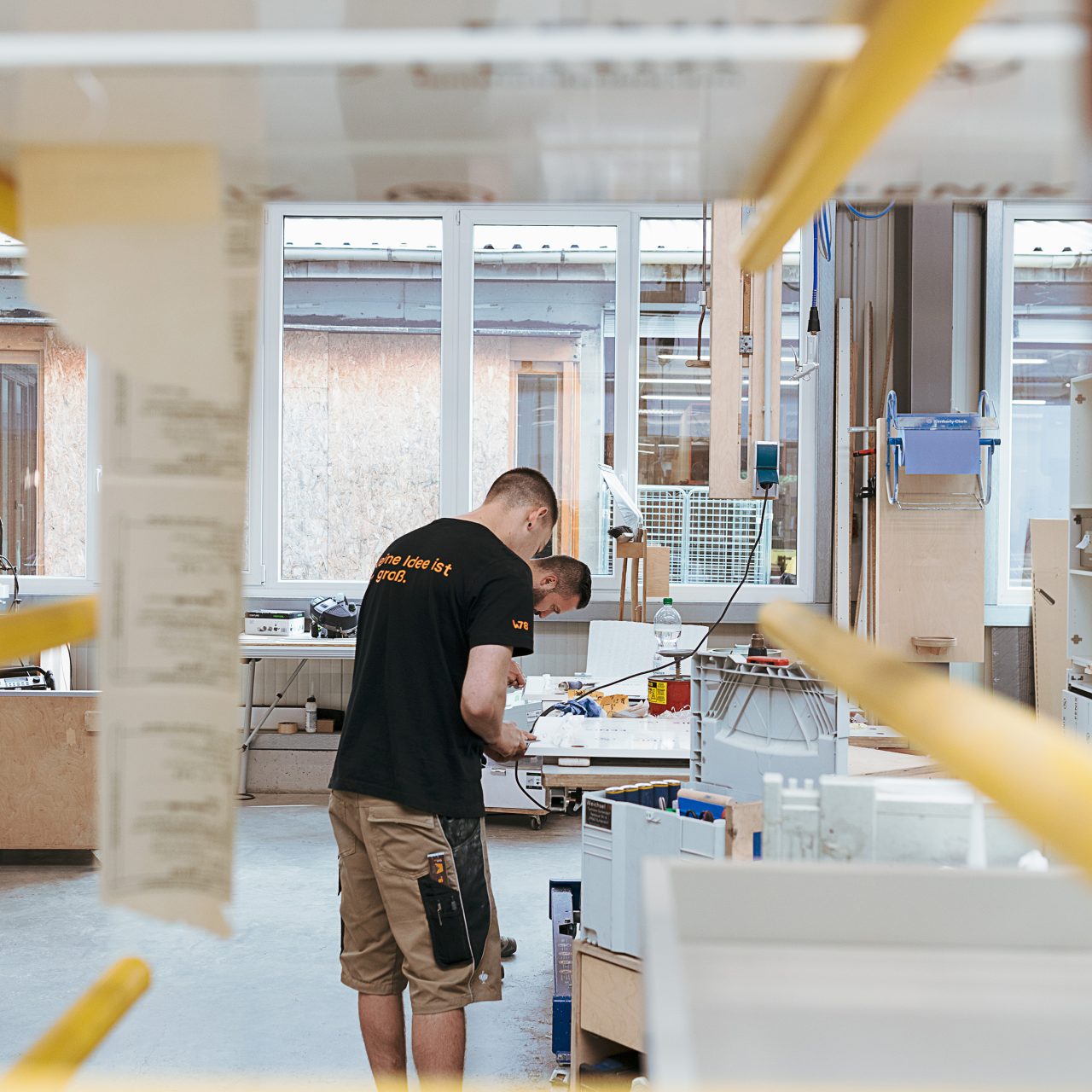
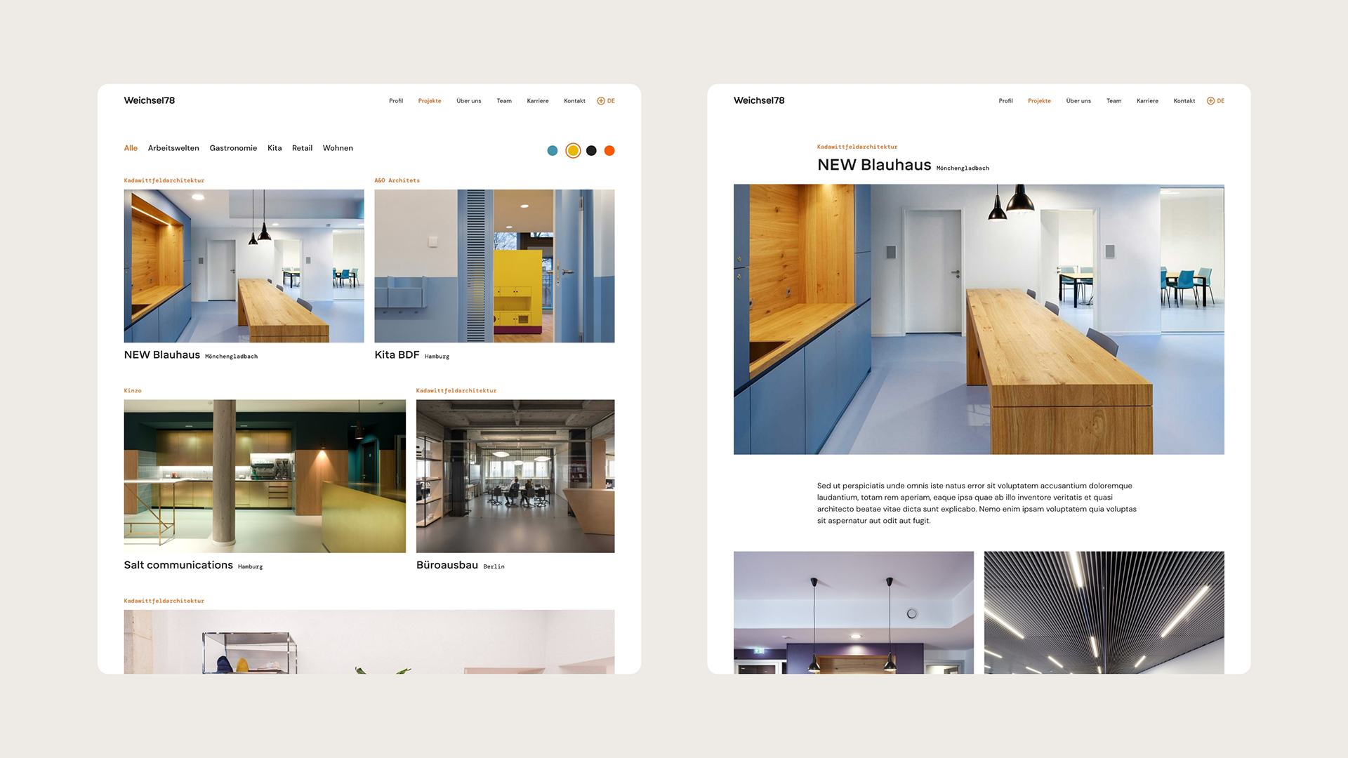
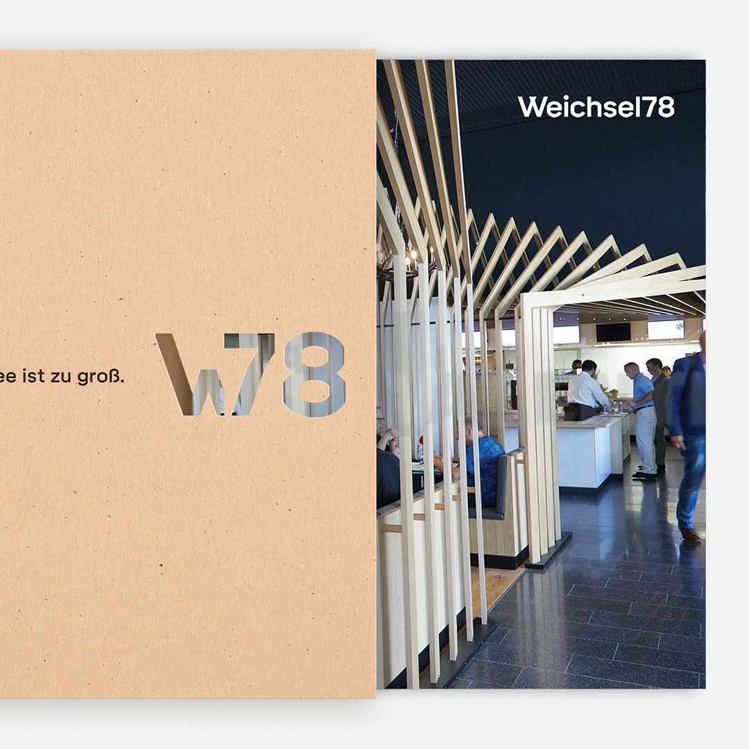
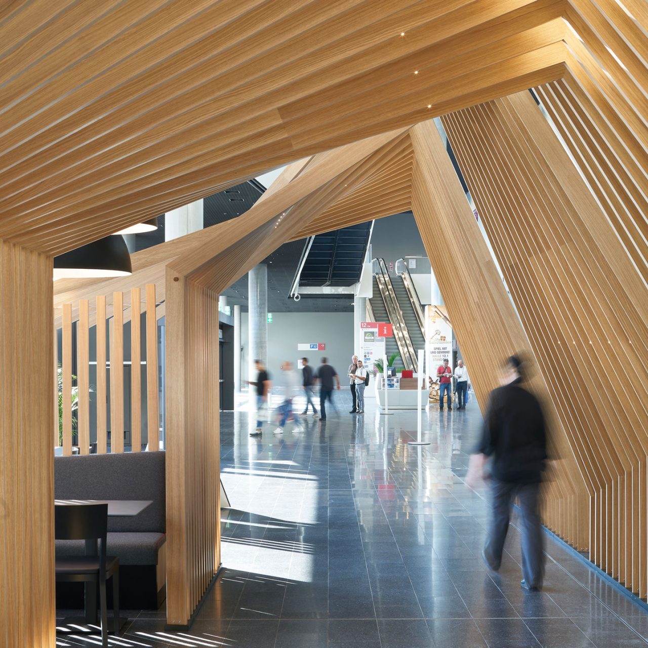
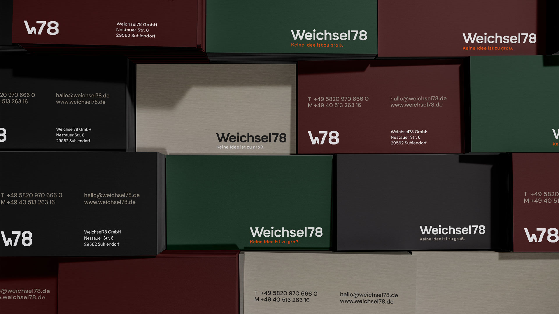
No matter how fantastic the interior concepts of the special joinery turn out, one thing remains unchanged for the traditional company to this day: To create art for the world with millimeter precision. No idea is too large. Which is why – as a proud new claim – it strengthens the company's identity. Clear edges and corners stand for millimeter-precise precision work. This dialectic is reflected in all elements of the redesigned brand - from typography, color scheme, and logo to the website's UX/UI.
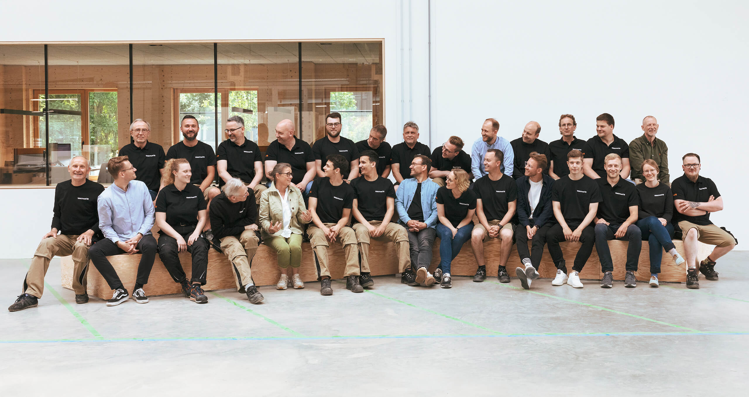
Working with LAUDO was characterized by an open and friendly atmosphere. Nevertheless, the project goals were never lost sight of. The result is impressive! Thank you.

Samuel Weichsel
CEO, Weichsel78
Thank you
Without the endless trust of Samuel, Simon and their team, we would not have come this far: We say thank you for the infinite energy and perfectionism of Weichsel78. We also say thank you to the Red Dot team for the wonderful Brand Design Award for our work.
