Overview
Berlin-based architecture firm Kinzo creates places where people come together - and to which they want to return. Individual and versatile, like their customers themselves. A stylistic touch that is reflected in their new webdesign. And it all started with a grinding machine and a homemade Berlin club.
The Berlin team of architects knows their craft - and word has spread. Little by little, crazier and crazier project requests came in all over the world. The demands on the brand had changed, but the focus on interior design, new work and building in the existing fabric remained.
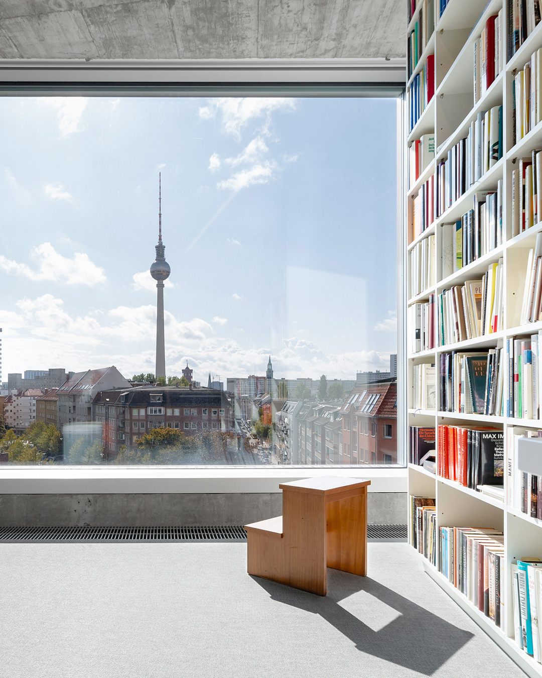
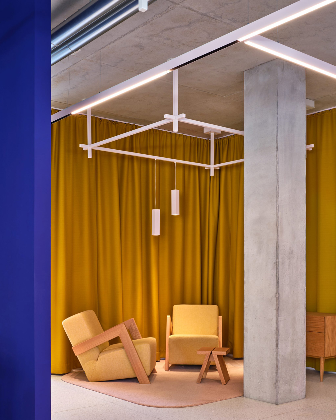
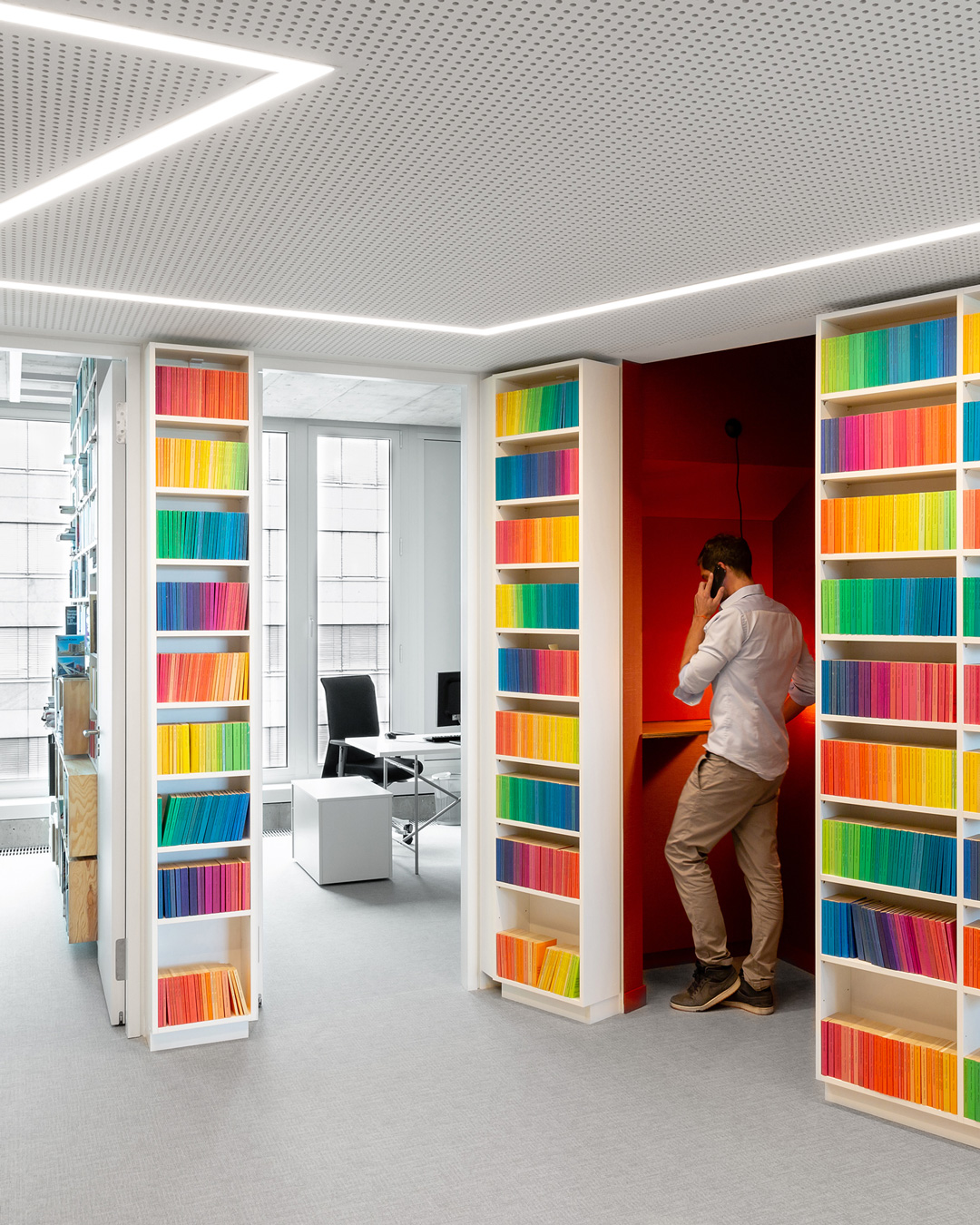
Kinzo's new digital flagship stands for big pictures, little text and strong storytelling. Working with an in-house illustrator, the company's story flowed into strong illustrations and personalized content. A photo shoot with lots of fresh imagery in a rough industrial style gives the website just that visual language that belongs to Kinzo.

Thank you
Once again, a project has demonstrated the potential unfolding when the team works together on eye-level. A big shout-out goes to Kinzo's public relations team and the illustration department who worked with our design team to create the unique look and feel. We proudly accept the Red Dot Design Award.
